Sleep Graph Improvements
complete
Rory Plewes
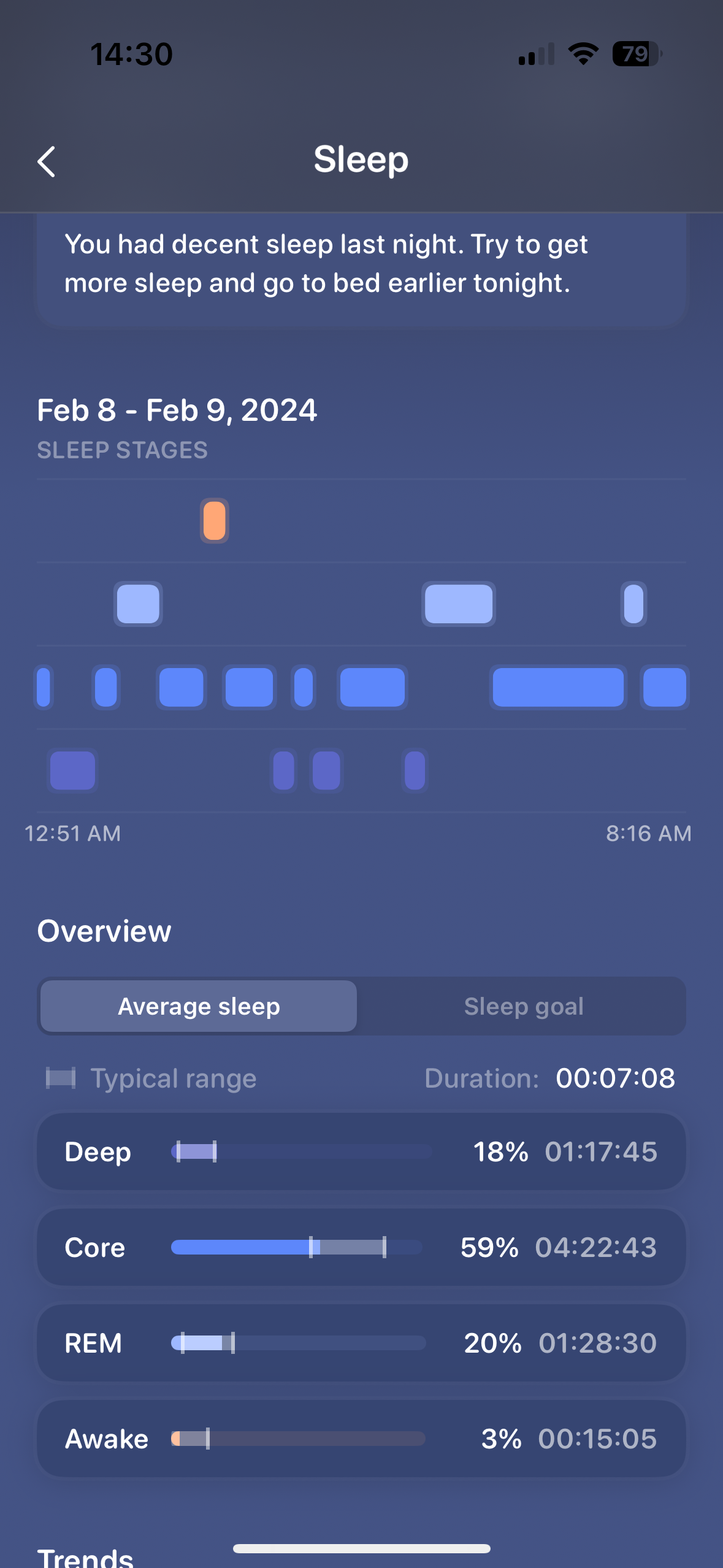
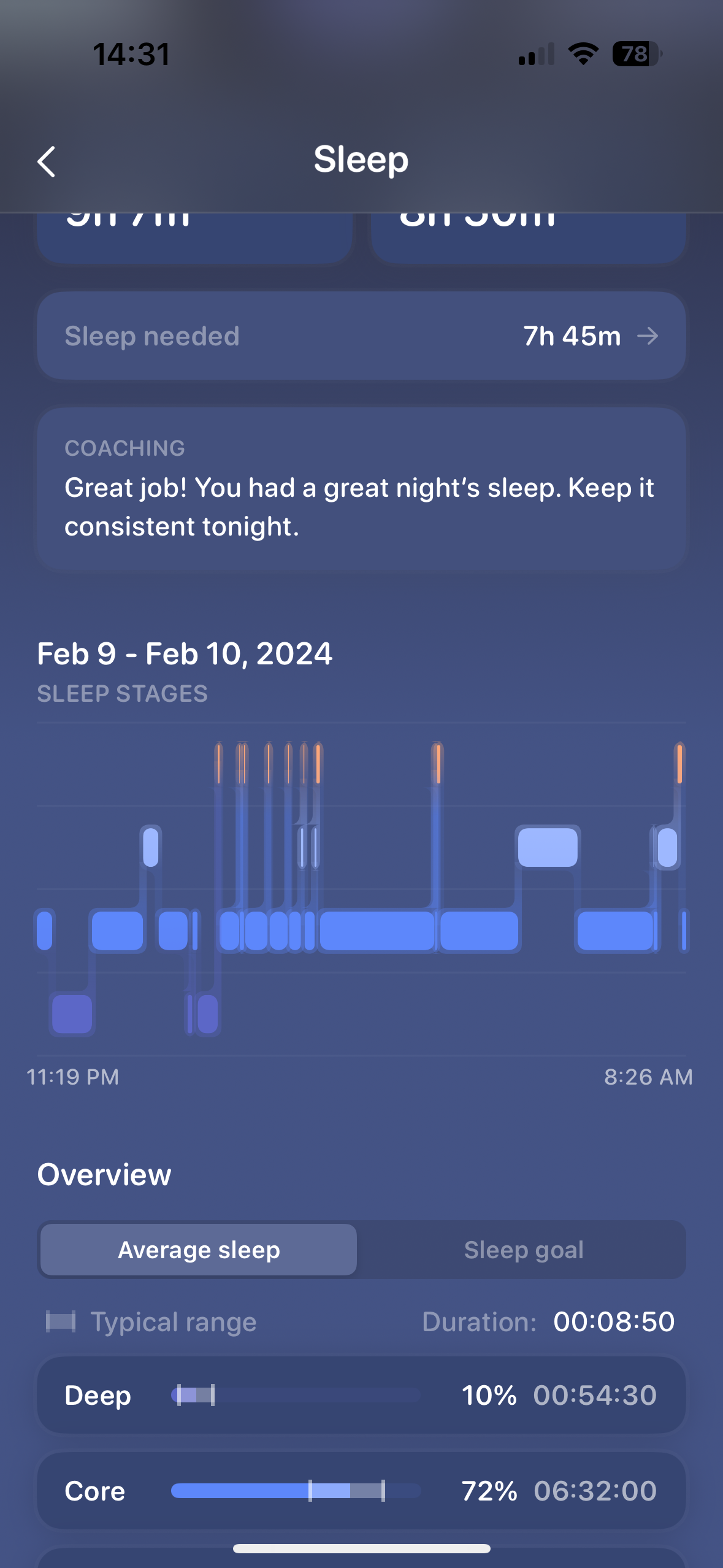
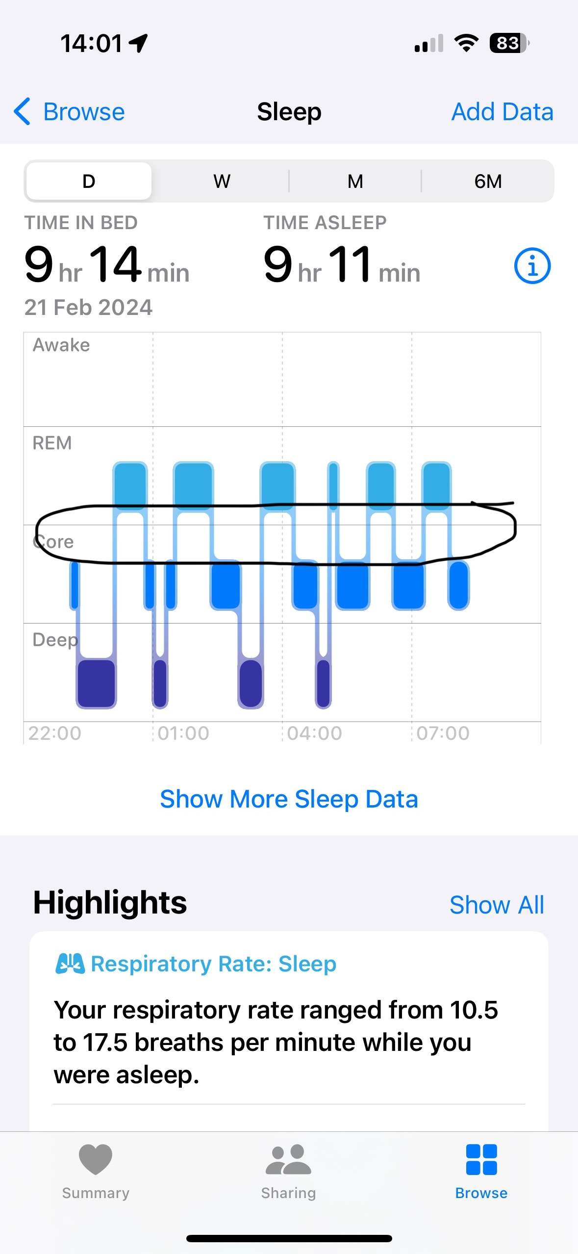
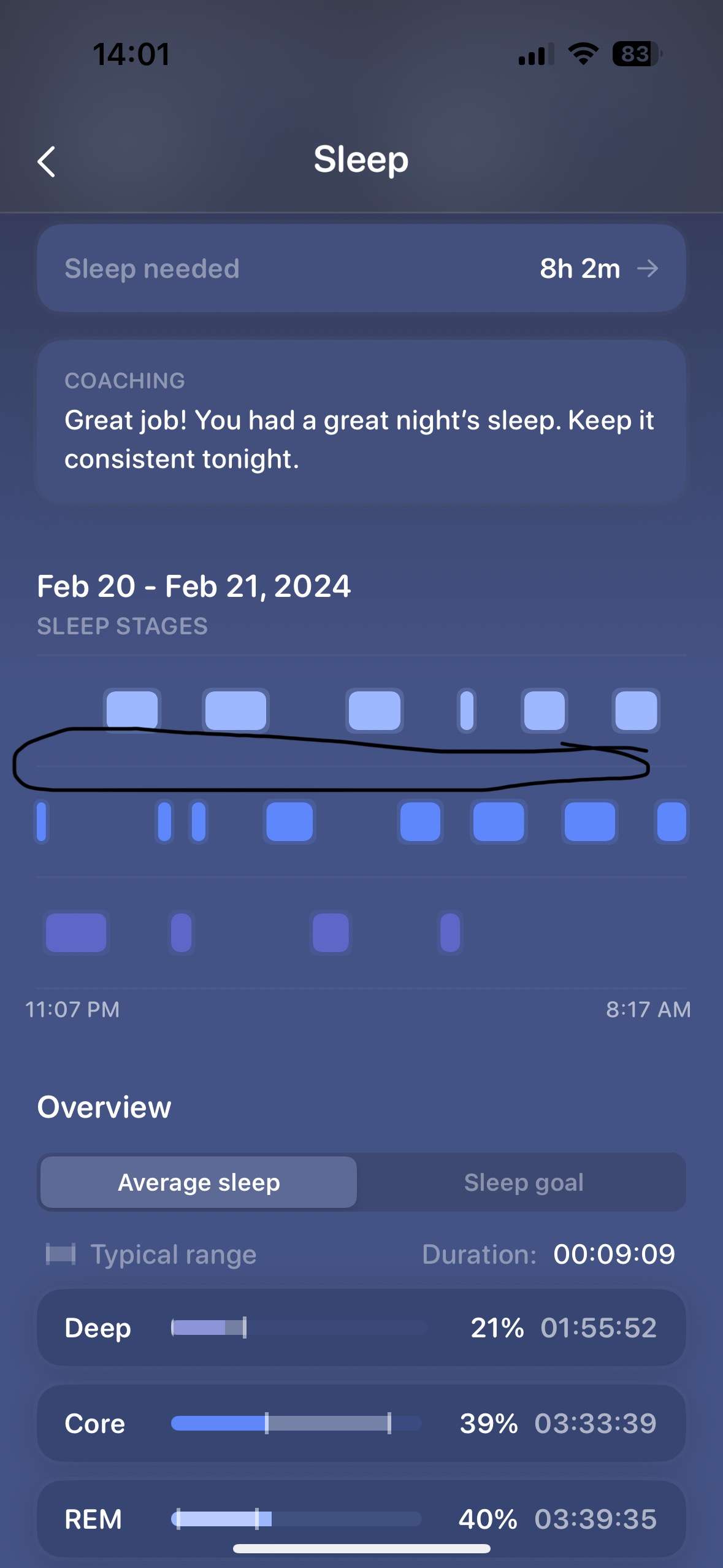
In the sleep section where you can view your sleep zones/ stages it includes a chart where you can see the stages throughout the night. However I find it hard to read and think it would be much easier to read if it had the small lines that connect the end of one sleep zone to the next sleep zone like in the apple graph.
Just a minor upgrade for user experience/ readability.

Grey
complete
Grey
in progress
Grey
planned (soon)
Rory Plewes
Grey Hi grey,
I have done some of my own investigating as I am trying to find my best sleep source. It doesnt appear to be related to sleep stages but seems to be related to the source of data?
If I set pillow to be my source it misses the lines. Whereas if my source is apple it doesnt.
Grey
Hi Rory Plewes, thanks for the feedback. The lines should be there, but it seems like this is a bug because your sleep chart doesn't have awake stages, so the lines disappear for some reason. If you check another chart that has awake stages, it should be there.
I can get this fixed asap
Rory Plewes
Grey Ahh, okay that makes sense. I have been having some really good sleeps recently and managing to get that awake stage to 0 quite often, so that explain why I have not seen it with the lines.
I was surprised when it didn't have lines as a majority of your UI is so clean and intuitive so I found this a bit odd as it seems so obvious to have the lines in the graph for user readability.
Rory Plewes
Grey It might not be as simple as sleeps with no awake time. Here are two sleeps. One has 1 awake stage and the other has multiple. But the one with 1 awake doesnt have the lines.
Could it be the provider of data?